Case study · 2024 · 4–5 months
UI/UX Design | Health & Wellness | iOS & Android App Redesign

My role
UI/UX Designer
Timeline
4–5 months · 2024
Team
1 Designer
1 PM
2 Developers (client side)
Platform
iOS, Android app, Website
Status
Introduction
The client
Garbh Sanskar Guru is a pregnancy wellness and education platform. It brings together Ayurvedic, spiritual and scientific guidance for expecting mothers, through sessions, books and activities for every stage of pregnancy. I worked on it through 4TYSIX.
My role
I led the redesign of the mobile app as the UI/UX designer. I reworked the information architecture, created a new visual language and built a component system that handles free and paid subscription states, working with the client's PM and developers.
Impact
The app relaunched on iOS and Android. The client reported a significant increase in subscribers after launch, along with positive feedback on how much easier the app is to use.
significant rise in subscribers after relaunch
app stores: live on iOS and Android
months from audit to launch
component system for every subscription state
01 — The problem
The app had a lot of valuable guidance, but it felt confusing. Users weren't sure how to get around, the content had no clear organisation, and the visual design felt dated. For an app used during one of the most personal times in someone's life, that was a big problem.
Navigation
"Where do I go next?"
Users weren't sure how to move around the app or where to find what they needed.
Organisation
Too much, too scattered
Sessions, books and activities were mixed together with no clear structure, so useful content got lost.
Feel
Dated, not caring
The old look didn't match the warm, supportive feeling mothers expect from a pregnancy companion.
The challenge
02 — Who it's for
Pregnancy is emotional and personal. The app needed to feel supportive, never overwhelming, while also helping the business grow its subscriptions. I designed for the mother first, and made sure the business goals fit naturally around her.
Mobile app
Mothers at every stage of pregnancy, looking for trusted guidance that blends tradition and science.
What they need
• Find the right session or book quickly
• Guidance that fits her stage of pregnancy
• A calm, supportive experience
What frustrates them
• Getting lost in the app
• Content with no clear order
• A look that feels cold or dated
The business
The team behind the content, who need the app to grow subscriptions and keep mothers coming back.
What they need
• More mothers subscribing
• Content that's easy to add and organise
• Clear value in the paid plan
What frustrates them
• Users dropping off from confusion
• Valuable content going unseen
• Free and paid features mixed up
03 — Research & strategy
Existing user feedback made the confusion clear. Instead of treating the app as a library of content, the strategy was to turn it into a guided pregnancy experience, built around what mothers need at each stage.

What the research told me
Insight 01
Structure beats volume
There was plenty of content. What was missing was a clear structure that told mothers where to start.
Insight 02
Emotion matters
Pregnancy is personal. Colour, tone and imagery needed to feel warm and reassuring, not clinical.
Insight 03
Free vs paid was unclear
Users couldn't easily tell what was free and what needed a subscription, which hurt trust and sign-ups.
How I worked
Feedback review
UX audit
Information architecture
Wireframes
Visual design
Component system
High-fidelity UI
Dev handoff
04 — Mapping the journey
I mapped how a mother moves through the app, from her first visit to becoming a regular subscriber. Every screen in the new structure has a clear place on this path.
Step 1
Discover
Mother
Opens the app looking for guidance.
The app
Welcomes her with a clear, warm home.
Step 2
Explore
Mother
Browses sessions, books and activities.
The app
Groups content so it's easy to find.
Step 3
Follow
Mother
Starts a session or activity.
The app
Shows clear progress and what's next.
Step 4
Subscribe
Mother
Wants more of what she likes.
The app
Shows the value of premium clearly.
Step 5
Return
Mother
Comes back as her pregnancy progresses.
The app
Has something new and relevant waiting.

05 — Key decisions
Each decision aimed to make the app feel like a caring guide, while giving the business a clear path to grow subscriptions.
The problem
The old design felt dated and cold, which didn't match the supportive role the app plays in mothers' lives.
Options I weighed
A soft, muted palette (calm, but easy to overlook), or a vibrant, positive palette that feels warm and full of energy.
What I chose
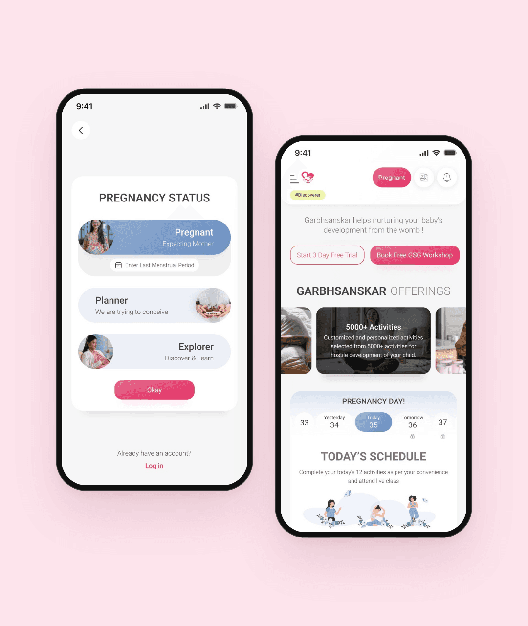
A warm visual language with pink as the main colour, supported by a few accent colours, rounded type and friendly imagery.
Why it worked
The app feels caring and joyful, and the content finally looks as valuable as it is.

The problem
Sessions, books and activities were mixed together, so mothers didn't know where to look.
Options I weighed
Keep one long feed (simple, but endless), or give each type of content its own clear home.
What I chose
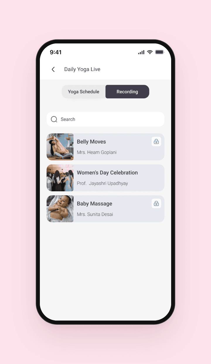
Content organised around three clear areas, sessions, books and activities, with simple navigation between them.
Why it worked
Mothers can go straight to what they need, and new content has an obvious place to live.
The problem
Free and paid content looked the same, and designing separate screens for every state would have been slow and messy.
Options I weighed
Separate screens for free and premium users, or reusable components that change based on subscription state.
What I chose
A component system where cards, buttons and content blocks adapt to free and paid states, with clear locks and upgrade prompts.
Why it worked
Mothers always know what's included, the value of premium is clear, and developers build each state once.

06 — Visual direction
Pregnancy is a hopeful time. I chose an energetic, warm pink as the main colour, with a few accent colours for variety, and paired it with rounded, friendly type so the whole app feels approachable and joyful.


07 — Design system
With free and paid users seeing different things, the components had to do the heavy lifting. I built a set of reusable components that adapt to each subscription state without extra screens.
Colour
Primary Pink
#EC407A
Soft Pink
#FDE4EC
Ink
#1A1A1A
Grey
#8A8680
Canvas
#F8F7F5
Typeface
Rounded and contemporary, friendly at large sizes and clear in small text.
Feel
Vibrant colours, soft shapes and plenty of space, so the app feels supportive, not overwhelming.
Components
Session cards, book cards, activity tiles, progress indicators, premium locks, upgrade prompts, navigation and empty states, each with free and paid variants.

08 — Final designs
A redesigned app that guides mothers through their pregnancy, with clear paths to sessions, books and activities, and a subscription experience that feels natural.
Explore & learn

Home
A warm welcome with clear paths to everything inside.
Sessions
Guided sessions, organised and easy to follow.

Books
Reading made simple, with progress you can see.
Activities & subscription

Activities
Practices for every stage, in one clear place.

Premium content
Clear locks that show what's included in each plan.

Subscription plans
Simple plans with the value spelled out.
09 — Outcome
The redesigned app relaunched on iOS and Android. The client reported a significant increase in subscribers, and positive feedback on how much easier the app is to use.
significant rise in subscribers after relaunch.
app stores: live on iOS and Android.
months from audit to relaunch.
"The new app finally feels like the caring guide we always wanted it to be, and our subscribers noticed."
Founder, Garbh Sanskar Guru
10 — Looking back
Advocate for design earlier
I'd be more deliberate in stakeholder decisions, presenting alternatives backed by UX evidence.
Test with mothers sooner
I'd put early prototypes in front of expecting mothers, to validate the new structure before high fidelity.
Measure the journey
I'd set up tracking for key steps, like first session and upgrade, to learn exactly where the redesign helped most.
Learnings
Advocating is part of the job
Good design needs a voice in the room. Explaining the why matters as much as the screens.
Design for the emotional context
Pregnancy is deeply personal. Tone, colour and words shape how safe people feel.
Conditional UI needs a system
Free and paid states only stay clean when components are designed for them from the start.
Enjoyed this case study?
© 2024 Garbh Sanskar Guru. All rights reserved. Designed by Shreya Pandya.